PROVIDED:
REBRAND
PRODUCT DESIGN
PRODUCT PHOTOGRAPHY
ECOMMERCE WEBSITE DESIGN
SEO COPY
PROVIDED:
REBRAND
PRODUCT DESIGN
PRODUCT PHOTOGRAPHY
WEBSITE DESIGN
SEO COPY
Prehemium
Prehemium is a premium cbd product brand with high-quality natural ingredients like raw, organic honey.
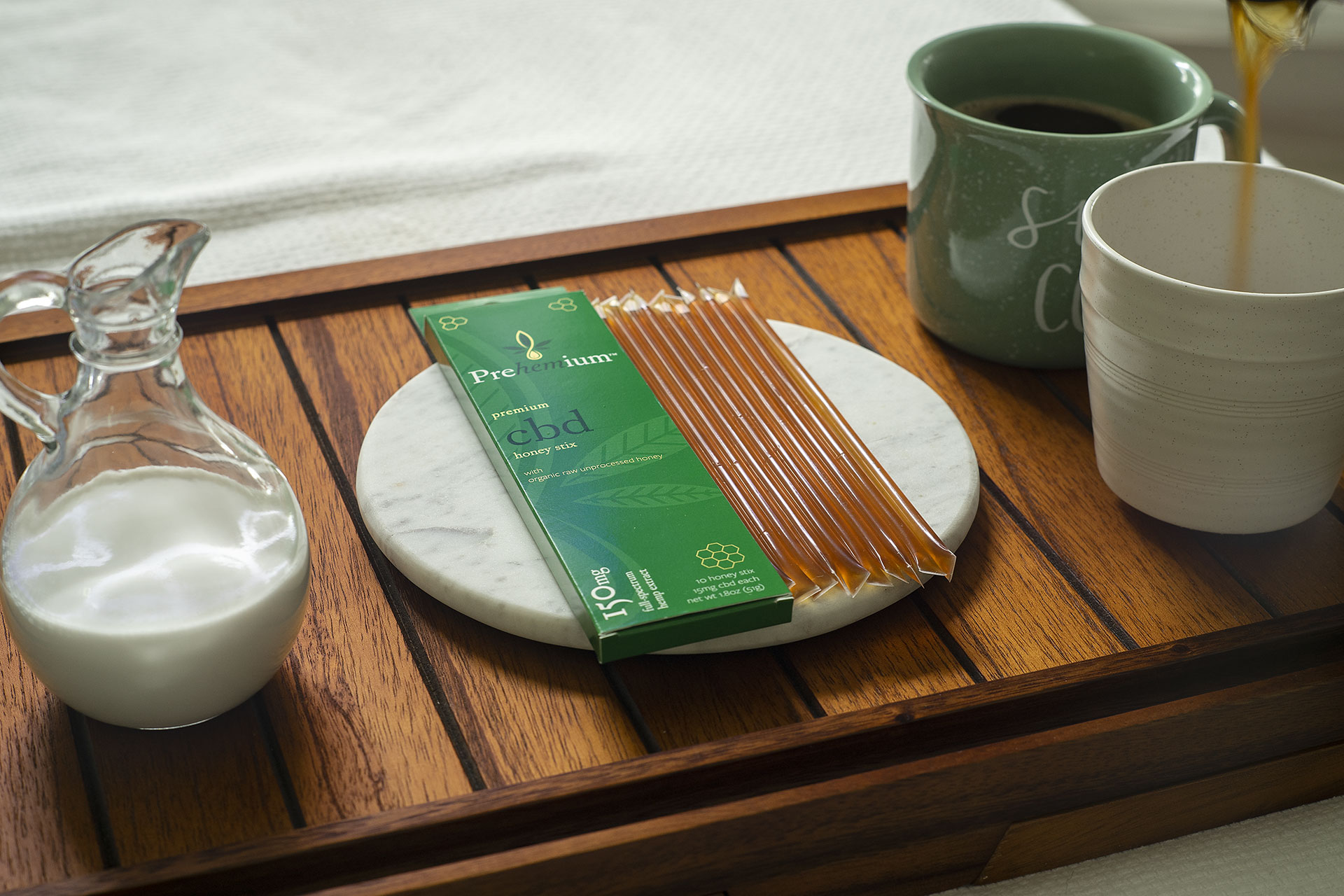
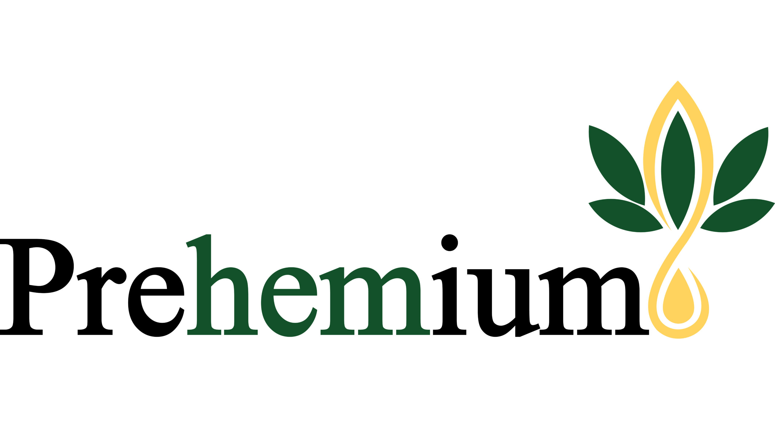
Prehemium had a pre-existing logo, but no high-res files and wanted to develop product packaging and an ecommerce website. I had to recreate the logo from scratch, so I suggested a slight rebrand and we created a new logomark, icon, color scheme and typography set. The goal with rebranding was to retain the structure and spirit of the logo and refine somehow to look extra premium. Once we finalized the new look, we created a new product and website, which you can view here.
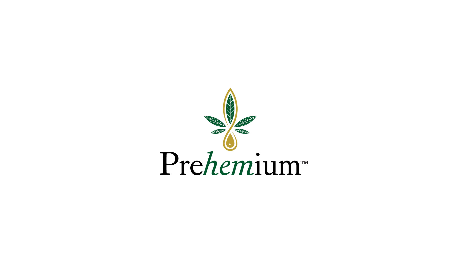
The revised icon has the leaves revolving around an invisible hexagon, which is symbolic for the cannabidiol molecule. For harmony, the leaves and golden drop all align on the 6 axis of the hexagon, while the proportion of the leaves in relation to one another is based on phi, the golden ratio.
Primary Typeface
Corundum Text | Adobe Typekit
by Joshua Darden
Secondary Typeface
Freight-Sans Pro | Adobe Typekit
by Joshua Darden
Prehemium typefaces are a pairing of serif and sans-serif fonts by the same designer.
Prehemium mentioned liking the font Aparjita, which comes standard on Windows, so I set out to find something less common that uniquely fit their personality.
Searching for selections, I came across Corundum, which was similar to Aparjita, but had some unique features. There was a great balance between the traditional look from a Serif style font that gives off a premium vibe and more modern, unique touches. Corundum included elements of a slab-serif font, which are usually interpreted as a little more friendly.
Once we settled on Corundum for the primary typeface, Freight-Sans Pro was chosen for similar reasons. It has elements of a traditional sans type, but the proportions of the letters and shapes are very unique within the sans category. Coming from the same designer, both fonts paired especially well in actual use.
The color palette was refined to include a monochromatic spectrum of green to identify various product types and provide accents in styling. Greens are deep shades or muted tones to provide both contrast and a calming, earthy appearance. Pantone 7730C and the halftones create a spectrum of sage, which is commonly associated with spa products. The intention was to diverge from common motifs in the hemp space with bright, saturated greens to a more natural health and wellness feel. Yellow was replaced with metallic gold for the extra premium touch, with black and white remaining for high contrast and visibility.
PMS BLACK C
RGB 35 | 31 | 32
CMYK 0 | 0 | 0 | 100
PMS 7734C
RGB 0 | 87 | 45
CMYK 77 | 0 | 82 | 65
PMS 7731C
RGB 0 | 131 | 62
CMYK 89 | 0 | 96 | 30
PMS 7730C
RGB 64 | 159 | 104
CMYK 68 | 0 | 71 | 18
PMS METALLIC GOLD 8644C
RGB 189 | 160 | 51
CMYK 30 | 34 | 100 | 0
WHITE
RGB 255 | 255 | 255
CMYK 0 | 0 | 0 | 0
PMS 7730C 80%
PMS 7730C 60%
PMS 7730C 40%
PMS 7730C 20%
