PROVIDED:
RESEARCH & STRATEGY
BRAND IDENTITY
PRINT (MENU)
PROVIDED:
RESEARCH & STRATEGY | BRAND IDENTITY | PRINT (MENU)
Brand Name
Our project started with market research and a brand name. Two common characteristics seemed to stick out with major dessert brands: Most were named after a person, real or fictional and many shared a cursive logomark. Betty Crocker, for example, is not a real person, just great branding.
The owner had mentioned The Southern Cheesecake Co from the start, but we continued to brainstorm. We liked it because it distinguishes itself from “NY Cheesecake” and it had a nice ring to it. I asked if there were anyone special to give the brand that personality that seems to sell all these desserts.. it could be a friend or anyone and bam. Her grandfather Cecil always encouraged her to bake and follow her dreams and the brand name was born.
Cecil's Southern Cheesecake Co.
Cecil’s is a specialty dessert company with a one-of-a-kind cheesecake recipe. Perfecting the recipe over 20 years, “Southern Style” cheesecake is less tangy and more creamy compared to other cheesecake brands. Southern Cheesecake is also laid back and fun with original and lip-smacking seasonal and year-round flavors you won’t find anywhere else.
Brand Name
Our project started with market research and a brand name. Two common characteristics seemed to stick out with major dessert brands: Most were named after a person, real or fictional and many shared a cursive logomark. Betty Crocker, for example, is not a real person, just great branding.
The owner had mentioned The Southern Cheesecake Co from the start, but we continued to brainstorm. We liked it because it distinguishes itself from “NY Cheesecake” and it had a nice ring to it. I asked if there were anyone special to give the brand that personality that seems to sell all these desserts.. it could be a friend or anyone and bam. Her grandfather Cecil always encouraged her to bake and follow her dreams and the brand name was born.
Styling
The stylistic goals were to create a logo that was fancy yet charming. Southern hospitality. Premium, hand-crafted, home baked.
The fonts in the logo were chosen because they are refined, yet have some attributes that make them less serious. Furthermore, heavier weights for both fonts were used to give it an overall plump, cheesecakey feel. SOUTHERN was emphasized as the largest to subconsciously address it’s DIFFERENT from NY style.
The icon overall symbolizes someone choosing the rest of the cake over a single piece, because it’s so good. The tall fork implies an elegance, while the plump cheesecake employing the golden ratio is a carefree, ditch the manners touch.
LORA - SECONDARY
GOOGLE FONTS
Bold | Semi-Bold | Medium | Regular
Bold Italic | Semi-Bold Italic | Medium Italic | Italic
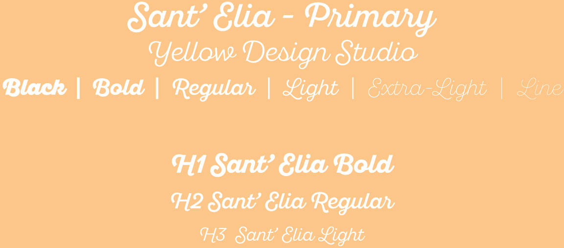
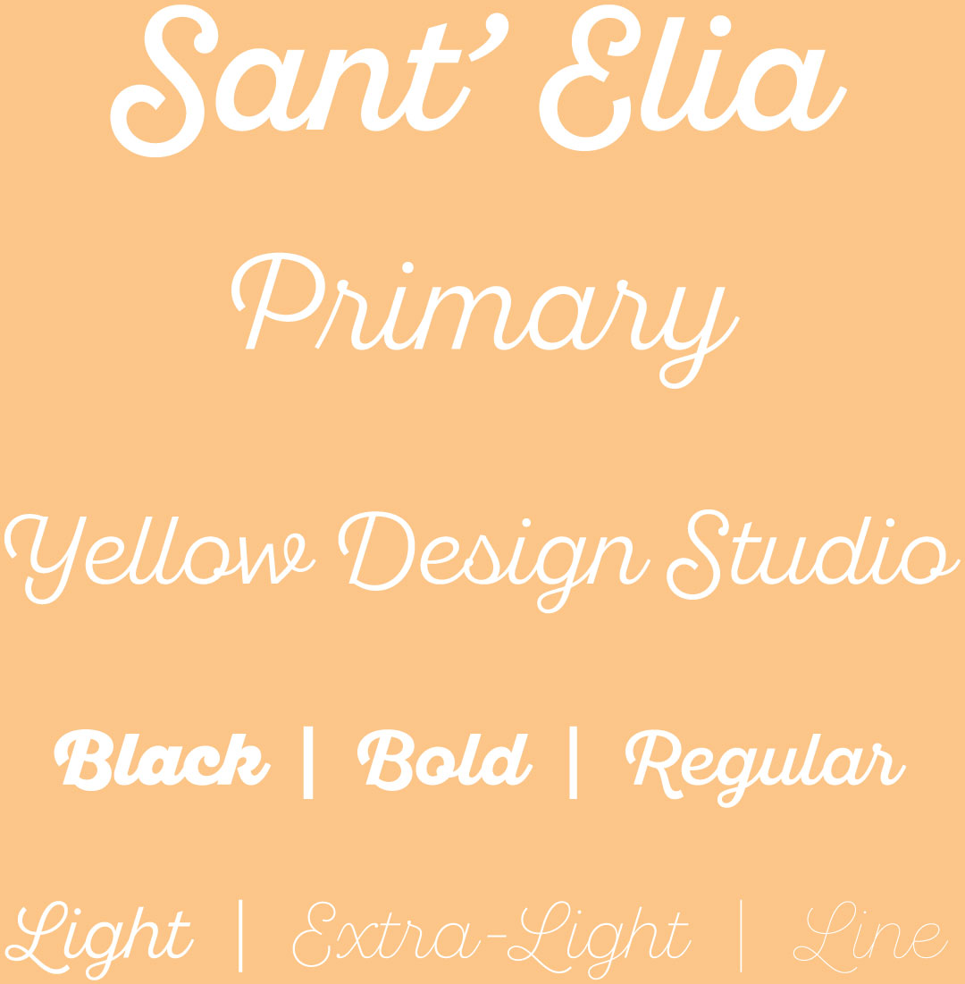
I first attempted to hand draw “Cecil’s” as the main logomark with Southern Cheesecake Co. as the tagline. The client wanted Cecil’s to be less of the focus, so I switched gears and purchased Sant’ Elia, a boutique font I haven’t personally seen in commercial use. It’s elegant, yet bouncy and not too serious. It’s unique without putting all the focus into a hand-drawn logo.
Once pleased with cursive selection, I narrowed down Lora as a secondary typeface. It makes for a legible body font, but especially enlarged, Lora has some very unique serifs (decorative endings). Lora is a slab-serif font, which gives it an elegant vibe that’s more relaxed compared to a classic serif font like Times New Roman.
The color palette was chosen based on digital print colors (CMYK) and was meant for small print runs of marketing and desert packaging. The client wanted to incorporate the color peach, so I chose a 50% muted orange and based all the other colors around it in fractional steps. The palette reflects the crust and filling of cheesecake.
CMYK
0 | 25 | 50 | 75
RGB
98 | 75 | 49
#624b31
CMYK
0 | 37.5 | 75 | 50
RGB
145 | 100 | 46
#91642e
CMYK
0 | 37.5 | 75 | 25
RGB
196 | 136 | 67
#c48843
CMYK
0 | 25 | 50 | 0
RGB
253 | 198 | 137
#fdc689
CMYK
0 | 25 | 50 | 17.5
RGB
213 | 169 | 118
#d5a876
CMYK
0 | 13 | 25 | 13
RGB
225 | 200 | 171
#e1c8ab
CMYK
0 | 7.5 | 15 | 0
RGB
255 | 235 | 214
#ffebd6

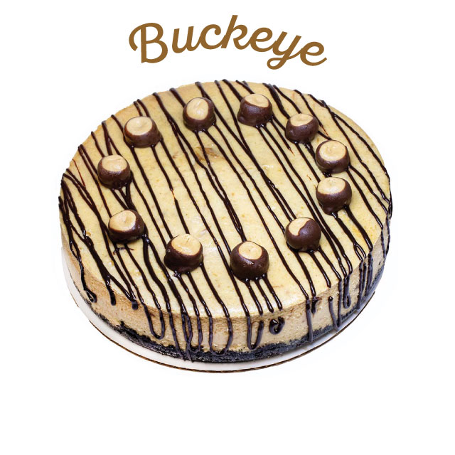
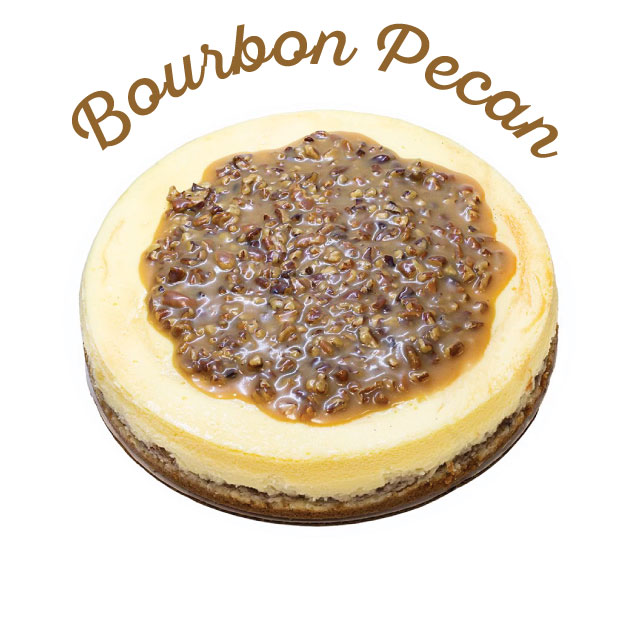
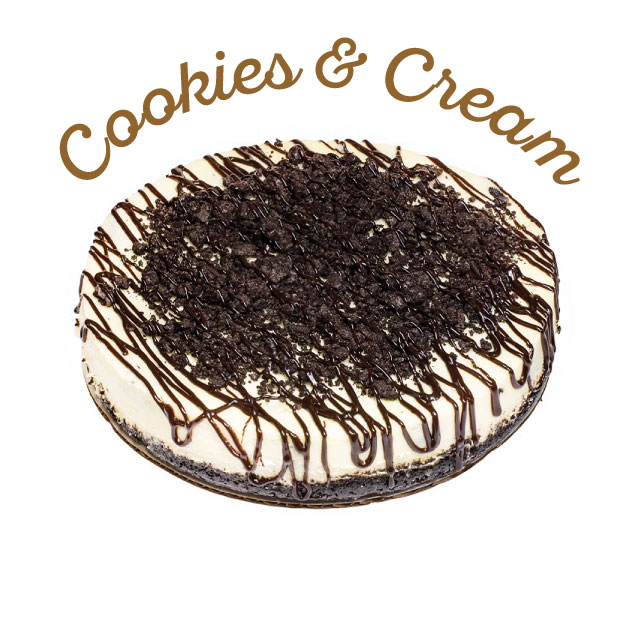
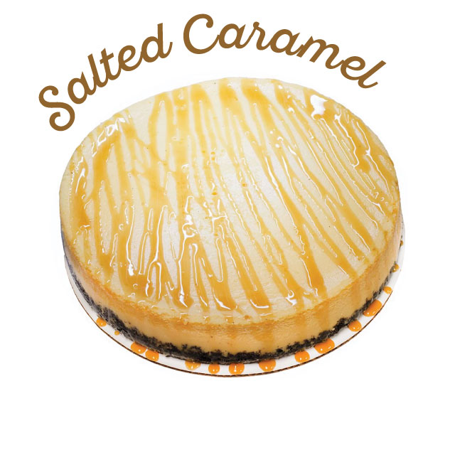
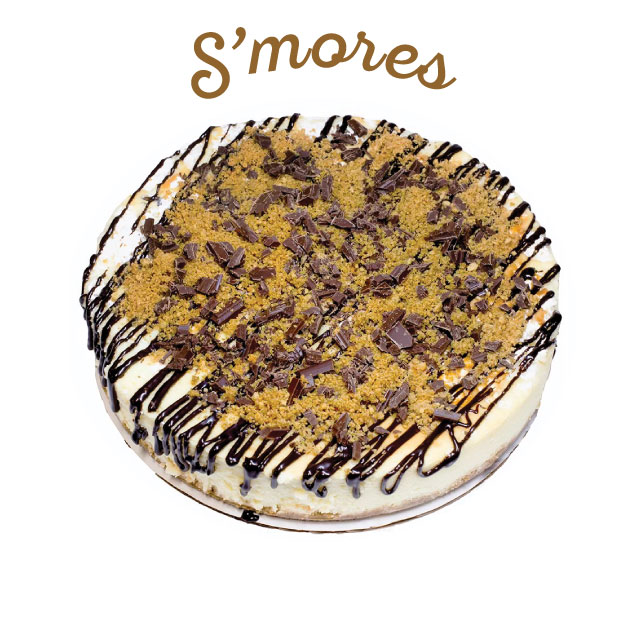
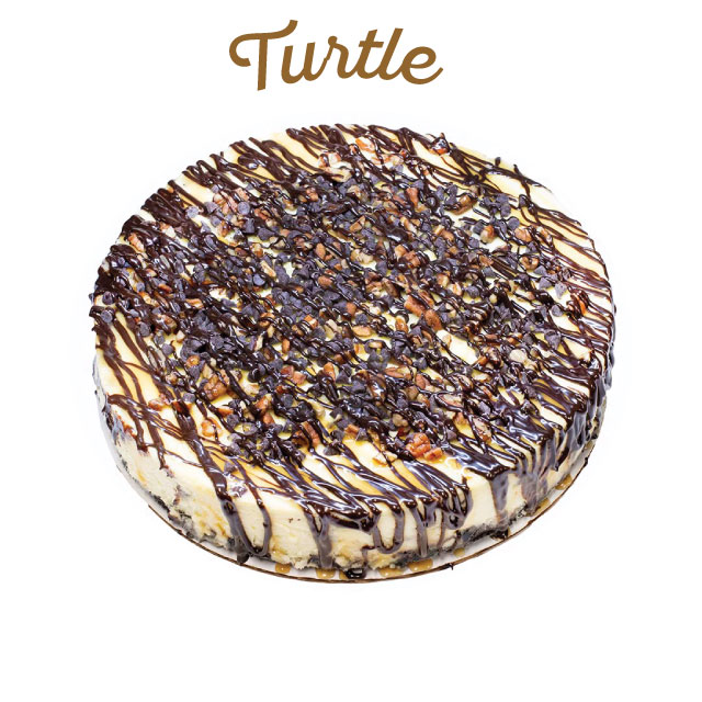
Chocolate cookie crust with salted caramel cheesecake, caramel drizzle on top.
