Mush Love is a premium, gourmet and functional mushroom farm/lab based in Nashville, TN with some very unique processes that result in a higher quality product. Namely, their patented “spore to spore” cultivation process and “vibrational technology” lead to less chances of contamination, higher nutritional value and more reliability as a distributor to groceries and restaurants. In addition, their focus on quality includes choice cuttings, elevated presentation and specialized service to chefs and foodies.
We wanted to position the brand as a high-end retail product that would fetch a premium, while also incorporating down to earth, farm-to-table vibes for a trustworthy local feel. Needless to say, high-end and farm-to-table don’t call for the same approach, so we started with some market research for the top local and national brands which you can view here and compared “high-end” and “farm-to-table” brands which you can view here. Market research provides a lot of key insights into competitive brands, what they are doing great, or poorly and how we can differentiate their unique brand identity. Comparing brands sets a laser focus on the target outcome visually versus creating preliminary drafts which has become a staple of my design process over time, saving tons of time.
After reviewing the market research and brand “compass”, we all agreed a general idea of the logo elements, as well as which vibe we were going to lean into – towards high-end, or farm to table. We agreed on somewhere in the middle and I went to work on a first concept, which you can view here. With a few refinements, we agreed on the final form and typefaces and launched the brand.
Mush Love, LLC
Mush Love is a premium, gourmet and functional mushroom farm/lab based in Nashville, TN with some very unique processes that result in a higher quality product. Namely, their patented “spore to spore” cultivation process and “vibrational technology” lead to less chances of contamination, higher nutritional value and more reliability as a distributor to groceries and restaurants. In addition, their focus on quality includes choice cuttings, elevated presentation and specialized service to chefs and foodies.
We wanted to position the brand as a high-end retail product that would fetch a premium, while also incorporating down to earth, farm-to-table vibes for a trustworthy local feel. Needless to say, high-end and farm-to-table don’t call for the same approach, so we started with some market research for the top local and national brands which you can view here and compared “high-end” and “farm-to-table” brands which you can view here. Market research provides a lot of key insights into competitive brands, what they are doing great, or poorly and how we can differentiate their unique brand identity. Comparing brands sets a laser focus on the target outcome visually versus creating preliminary drafts which has become a staple of my design process over time, saving tons of time.
After reviewing the market research and brand “compass”, we all agreed a general idea of the logo elements, as well as which vibe we were going to lean into – towards high-end, or farm to table. We agreed on somewhere in the middle and I went to work on a first concept, which you can view here. With a few refinements, we agreed on the final form and typefaces and launched the brand.
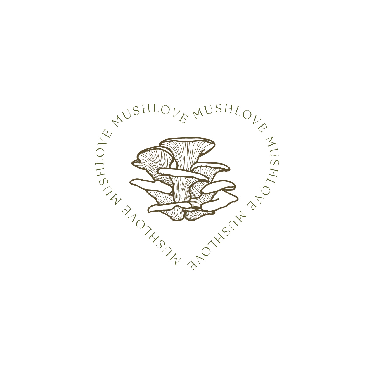
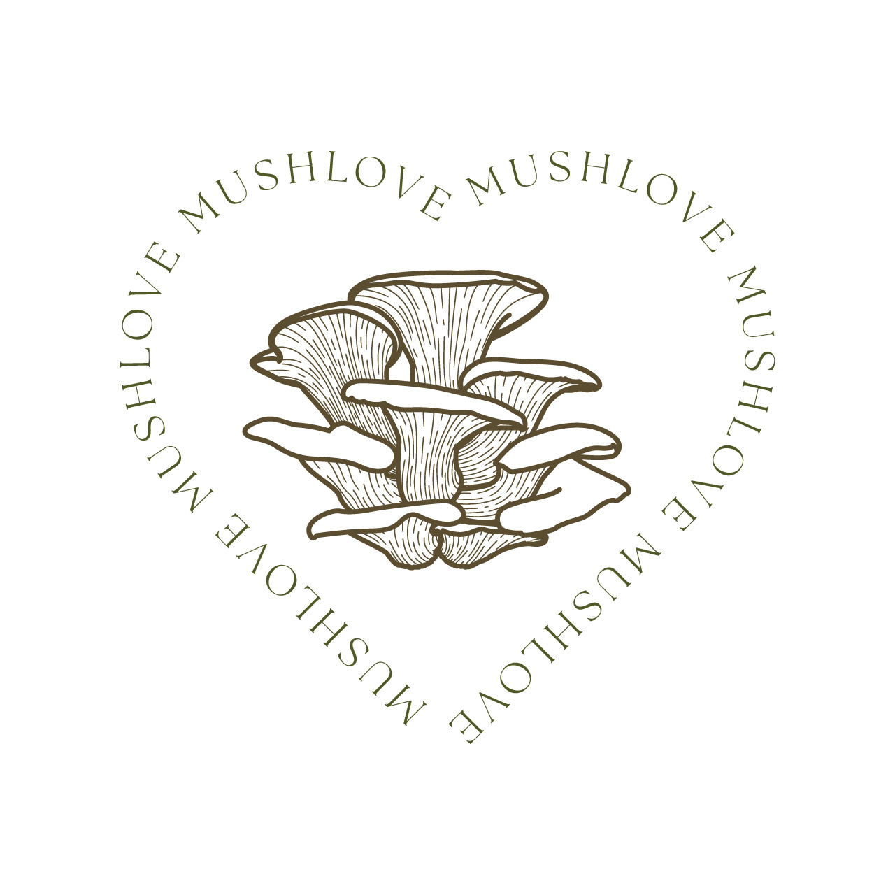
The overall intention was to showcase a beautiful mushroom specimen shining with light rays, detailed with fine lines to illustrate the premium nature of the brand. To supplement the premium feeling, we chose a decorative primary Serif typeface that mirrors the fine lines in the graphic elements. Secondary elements were chosen to tone down the premium feel towards the farm-to-table vibe, such as the hidden heart in the middle of the graphic created using negative space, the earthy color palette and the secondary font which is clean, modern and quirky. Additionally, we created a sub version of the primary logo to use for products supplied to chefs and an additional icon for stickers, decorative placement on packaging and other potential future uses.
Primary Typeface
The Seasons | Adobe Typekit
by Elena Genova
Secondary Typeface
Josefin-Sans | Google Fonts
by Santiago Orozco
The Seasons is a beautiful typeface suitable for headlines and decorative placement, chosen for its premium feel without being too stuffy. Vintage serif style paired with a modern spin made The Seasons a top contender for the primary font choice.
Josefin Sans is a modern, geometric yet elegant typeface with some unique elements that set it apart from other modern, sans styles. Unlike ultra-neutral sans fonts like Helvetica, it has some quirks such as the upward sloping lowercase e and a with rounded terminals that give it a distinctive character.
While based on geometric shapes (square, triangle, circle), thin strokes, high x-height, and slightly elongated letterforms give Josefin Sans a modernist elegance, reminiscent of art deco posters. This makes it feel simultaneously vintage and contemporary.
Josefin Sans has 7 weights ranging from 100-thin to 700-bold in both regular and italic, making it a versatile typeface for a variety of uses, lending itself to a large range from small packaging details to headlines, subheadings and body in web, digital and print marketing.
CMYK
66 58 82 70
RGB
42 43 24
HEX
2A2B18
CMYK
67 52 93 58
RGB
53 60 27
HEX
353C1B
CMYK
64 45 100 37
RGB
79 89 39
HEX
4F5927
CMYK
34 12 89 0
RGB
180 192 74
HEX
B4C04A
CMYK
50 69 75 63
RGB
69 44 33
HEX
452C21
CMYK
52 56 82 42
RGB
91 76 48
HEX
5B4C30
CMYK
30 30 50 25
RGB
145 134 108
HEX
91866C
CMYK
20 20 40 0
RGB
206 193 159
HEX
CEC19F
CMYK
28 80 100 23
RGB
152 69 34
HEX
984522
CMYK
13 58 100 2
RGB
213 125 39
HEX
D57D27
CMYK
8 32 100 0
RGB
234 175 33
HEX
EAAF21
GOLD 871C
CMYK
0 11 68 21
RGB
210 182 92
HEX
D2B65C
The primary color palette was developed to reflect deep forest shades paired with a variety of neutral mushroom tones ranging from deep red reishi to tan oyster and shitake. A variety of color palettes were initially developed using images of forest scenes and mushroom varieties, which can be viewed here on pages 3 to 8. Colors were chosen from these scenes, then mathematically dialed in to harmonize with each other using color theory. Secondary accent colors were chosen based on foraged mushroom varieties such as amanita and chanterelle, which have more vibrant colors for a pop against the neutrals when needed. Finally gold foil was added as an accent, intended to be used in print and packaging to showcase the premium nature of the products. As a whole, a wide color palette range was chosen with the future intention to represent a wide range of products, from raw and dried mushrooms to powders, tinctures and other natural supplements.